

The components
Last updated 14 August 2026
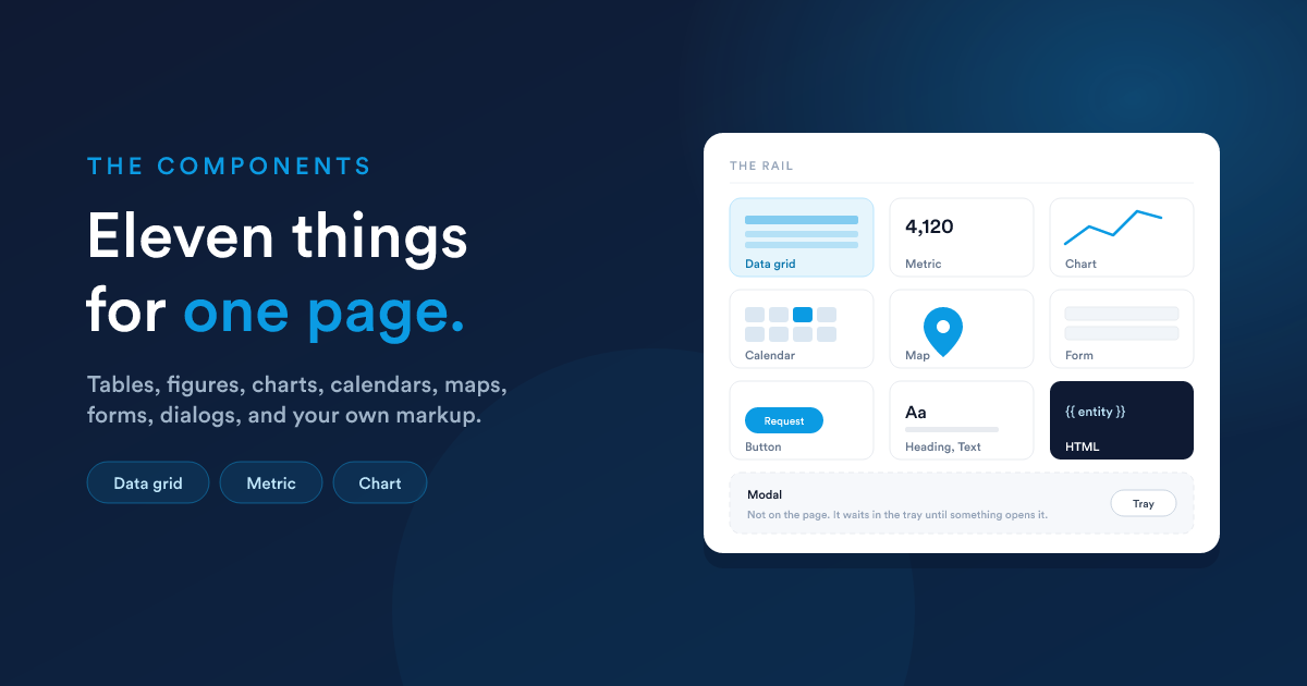
Components live in the rail on the left of the builder. Drag one onto the page and configure it in the panel on the right.
The eleven, at a glance
| Component | Lands at | Fed by | For |
|---|---|---|---|
| Data grid | full width, 14 rows | a report | a table of the customer's records |
| Metric | quarter width, 5 rows | a report | one figure, with something to read it against |
| Chart | half width, 12 rows | a report | a line, bar or pie |
| Calendar | two thirds, 16 rows | a report | appointments, jobs, deadlines |
| Map | half width, 12 rows | a report | locations, and pins customers can drop |
| Form | half width, 12 rows | a form | letting a customer send you something |
| Button | 6 columns, 2 rows | going to a page, opening a dialog, or a link | |
| Heading | full width, 2 rows | a title | |
| Text | full width, 4 rows | a paragraph | |
| HTML | full width, 8 rows | your markup | anything the rest cannot do |
| Modal | not on the page | markup or a form | a dialog something else opens |
The five report-fed components all need a Data Grid report, never an HTML one. See Data and reports.
Data grid
A table of rows, paged, with the report's own columns and formatting.
| Setting | What it does |
|---|---|
| Report | a Data Grid report. Required |
| Records Limit | rows per page. Default 20 |
| Order By Column | one of the report's columns |
| Order Direction | ascending or descending |
Ordering is optional, and optional together: a report that already orders itself needs neither.
A cell is drawn as the report wrote it, formatting and links included. That is usually what you want, and it has one consequence worth checking: a report built for staff often contains links to staff screens, which on a portal lead to the sign-in page. A report meant for a portal wants its own column formatting.
Metric
One number, with something to read it against. The report returns one row, and its columns fill the card's slots.
| Setting | What it does |
|---|---|
| Report | a Data Grid report returning one row. Required |
| The number | the column holding the figure. Required |
| Beside the number | short text from a column, such as 6 applications |
| Compared with | an earlier figure. The difference is worked out for you |
| A rise means | Things are better or Things are worse, so a rise is green or red |
| Colour | Plain, Blue, Green, Amber, Red, Purple, or From a column |
| Colour from a column | required once the colour comes from the report |
| When the card is clicked | nothing, open a modal, or open a page |
Three things worth knowing:
- Formatting stays in the report. Rounding, currency symbols and percent signs are the report's decisions, so the card shows the figure exactly as it arrives.
- No row is not a zero. A report returning nothing for this customer draws an empty note rather than a confident
0. - The card is the whole component. Its name is drawn along the top of the card, so naming it never wraps it in a second box.
When a click opens a modal, the report row travels with it, keyed by the report's own column names. Rename a column and the dialog reads a different key.
Chart
A report, plotted. The chart type is chosen first, because it decides which of the other settings apply.
| Setting | Applies to |
|---|---|
| Report | all. Required |
| Chart Type | Line, Bar or Pie. Required |
| Records Limit | line, bar. Default 20 |
| Order By Column and Order Direction | line, bar |
| Horizontal (x) axis | line, bar. Required |
| Vertical (y) axis | line, bar. Required, and takes more than one column |
| Slice labels and Slice values | pie. Both required |
A pie hides the limit and the ordering deliberately: a slice is read as a share of a whole, so plotting the top 20 of 200 rows would put a percentage under every slice that is a share of nothing anybody asked about.
The vertical axis is the one setting that takes several columns, because a line chart comparing two measures is an ordinary thing to want.
Charts are drawn by the same renderers as the CRM's own dashboards, so a report plotted here and the same report plotted on a dashboard look alike.
Calendar
Appointments, jobs, renewals and deadlines, from a report.
| Setting | What it does |
|---|---|
| Report | a Data Grid report. Required |
| Event name | the column holding the title. Required |
| Starts on | the date column. Required |
| Starts at | the time column. Leave it empty and every event is a whole day |
| Ends on and Ends at | optional |
| Event ID | the record's own id, handed to whatever a click opens |
| Colour | a column returning a CSS colour, such as #0b84cf |
| Opens on | Month, Week or List |
| Clicking an event | nothing, open a modal, or open a page |
Date and time are separate columns, because reports keep them separate. The time is what makes a row a moment rather than a whole day, and that is decided per row, so one calendar legitimately holds both.
The visible month reaches your report. As the customer navigates, the range on screen is available to the report's SQL as {{ range.from }} and {{ range.to }}, so a schedule query can return one month at a time rather than the first few hundred rows of everything.
When a click opens a modal, the event travels with it keyed by role (id, title, start, end, startDate, startTime, endDate, endTime), so renaming a report column does not break the dialog.
Map
Locations as pins, from a report.
| Setting | What it does |
|---|---|
| Report | a Data Grid report. Required |
| Latitude column and Longitude column | required |
| Column with the marker name | optional |
| Column shown when a marker is clicked | optional |
| Zoom | default 4 |
| Group markers that overlap | draws crowded pins as one numbered circle |
| Let customers drop and edit a pin | turns the map into an input |
| Send the pin to this address | required once pins are on |
| Column holding the location ID | needed to edit existing locations |
A row whose coordinates are missing or out of range is dropped rather than drawn, so an incomplete row does not put a marker in the Atlantic. A map shows up to 200 markers and has no paging, deliberately: every marker is drawn at once or the picture is a lie about where things are.
Dropped pins are posted to a dynamic endpoint of yours. The address is read on the server and never reaches the page, so nobody can post fabricated coordinates to it from outside the portal. Your endpoint receives the position, the name and description, the location id if there is one, and who is signed in. Answer with the saved record's id ({"id": 123}) and the customer can edit that pin afterwards.
Form
An existing Flexie form, drawn into the page.
| Setting | What it does |
|---|---|
| Full width, as tall as its content | recommended for anything but the shortest form |
| Form | the form to show. Required |
Only published external forms can be used. An internal form is filled in by staff against a record they have open, so it has nothing to open against on a portal.
The form knows who is signed in, so fields matching the customer's own record are prefilled. Submissions arrive exactly as they do from your website, which means every workflow already listening to that form keeps working. See Forms.
Button
| Setting | What it does |
|---|---|
| Label | required |
| Does | Opens a page, Opens a modal, or Opens a link |
| Page, Modal or Address | whichever the action needs. Required |
| Style | Primary, Secondary or Link |
Heading
| Setting | What it does |
|---|---|
| Content | the text. Required |
| Size | Large, Medium or Small |
Text
| Setting | What it does |
|---|---|
| Content | a paragraph. Line breaks are kept |
A heading and a paragraph are their own content, so neither is drawn in a panel until you give one a name, which needs a title bar to live in.
HTML
Your own markup, rendered on the server against the signed-in customer.
| Setting | What it does |
|---|---|
| Wrap the component | on by default. Turn it off and there is no panel at all: what the page shows is exactly your markup |
| Full width, as tall as its content | for a document whose length varies per customer |
| Content | the markup, written in the built-in editor |
This is the escape hatch, and it has a page of its own: HTML components. What that markup can call is The JavaScript API.
Modal
A dialog. It is not placed on a page: it sits in the modal tray and is opened by something else: a button, a calendar event, a metric card, or your own script.
| Setting | What it does |
|---|---|
| Title | required |
| Opens | When something opens it, As soon as the page is shown, or On a named event |
| Event name | required for the third |
| Width | Standard or Full width |
| Content from | Written here or A form |
| Form | required when it holds a form |
| Content | required when the markup is written here |
Exactly one of the last two is ever asked for, and a modal holding neither is the configuration mistake with no symptom on the page: it sits in the tray looking finished, and the first person to meet it is a customer who clicks something and gets an empty dialog. Publishing refuses while one is in that state, and the tray marks it.
A modal is refetched every time it opens, so it always shows current data and its script always sees the parameters it was opened with.
Which one, for the common asks
| The ask | The component |
|---|---|
| "Show my customers their invoices" | Data grid |
| "Put their balance at the top" | Metric |
| "Show spend over the year" | Chart |
| "Show their upcoming appointments" | Calendar |
| "Let them tell us where to deliver" | Map with pins on |
| "Let them request something" | Form |
| "Show them a document made from their own data" | HTML, full height |
| "Let them open a detail view from a row" | Modal, opened by a click |