

Building a portal
Last updated 14 August 2026
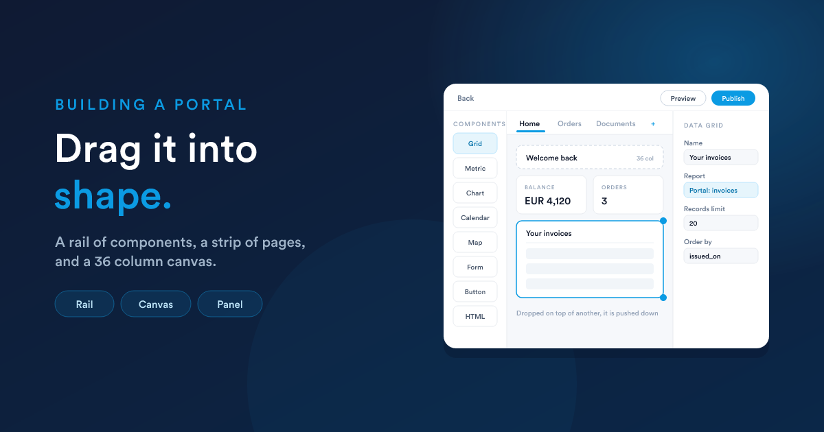
A portal is created from the portal list, then arranged in a drag-and-drop builder where pages and components sit on a 36 column grid.
1. Create the portal
New on the portal list asks for a handful of things. Only the first group is about the portal; the second is about who may sign in to it.
| Field | What it is |
|---|---|
| Name | what you call it internally, and what a customer sees in the sign-in email |
| Alias | the last part of the public address. Left blank, it is made from the name |
| Active | whether the address answers at all. A new portal starts inactive |
| Description | a note for your own team. Customers never see it |
The public address is then:
https://<your-flexie-address>/portal/<alias>It is shown as a link in the builder's sidebar, so you never have to assemble it by hand.
Who the customers are
| Field | What it is |
|---|---|
| Choose an entity | which record type your customers are: contacts, accounts, or a custom record type |
| Which Customers | an optional saved filter. Leave it blank and everyone on that entity may sign in |
| Email Field | the address they sign in with |
| Name Field | what to greet them by |
| Access Field | a yes/no field that turns one customer's access on and off |
Only email fields marked as a unique identifier on the entity can be chosen, because one address has to match exactly one customer. If the list is empty, the entity has no such field yet. Mark one and come back.
This is covered in full, including what happens when a filter or a field is changed later, in Customers and sign-in.
2. The builder
Click the portal's name in the list and the builder opens. The screen has four parts:
- The rail, on the left, is the component library. Drag one onto the canvas.
- The page strip, across the top, is your pages. They are also the customer's menu, in this order. Add page appends one, and a page can be renamed or removed from the same strip.
- The canvas is the page being edited, drawn on the same grid the customer's browser will use.
- The settings panel, on the right, configures whatever is selected. With nothing selected it shows the portal's own settings instead.
Above them all sits one band with Back, Preview, Publish and, once there is unpublished work, Discard changes.
The Theme and Settings tabs beside Layout are not yet available. Everything described here is on the Layout tab.
The sidebar
The left-hand sidebar holds the portal's own settings (name, alias, active, description, the public address, and the customer fields above), each editable in place. Changing them there saves immediately, because they are properties of the portal rather than of the layout.
3. Placing components
The canvas is a 36 column grid. A component is a rectangle on it: so many columns wide, so many rows tall.
| Width | Columns | Reads as |
|---|---|---|
| Full width | 36 | a table, a heading, a document |
| Half | 18 | two charts side by side |
| Third | 12 | three cards in a row |
| Quarter | 9 | four figures across the top |
Drag a component to move it, drag its edge to resize. Two components cannot occupy the same cell: one dropped on top of another is pushed down rather than overlapping.
Widths are proportions, not pixels. 18 columns is half the page whatever the screen is, so the canvas being wider than the real portal is not a mismatch. The component keeps its share of the width.
Sensible starting sizes
Each type lands at a size that already reads as itself, and those are listed per type in The components. The two worth knowing up front: a data grid arrives full width, because a narrow table is unreadable, and a metric card arrives at a quarter width, because four of them across the top is what a row of figures looks like.
On a phone
Below roughly 768px the grid stops being a grid. Every component becomes full width and takes the height its content needs, in reading order: top to bottom, left to right. Two components side by side become one above the other, in the order you would read them.
Nothing has to be configured for that, but it is worth checking your page reads sensibly in that order before publishing.
When no height is right
Some content has no height anybody can know in advance: a document that is a page long for one customer and three for another, or a form that grows as sections open.
The Full width, as tall as its content setting on an HTML component or a form component takes it out of the grid and gives it a band of the page to itself, in the place you drew it. It stays where it is, takes the whole width, grows to whatever it turns out to need, and everything below it moves down by exactly that much.
4. Naming components
Every component has a Name, and for most types it becomes the title bar of the panel it is drawn in. Types that are their own content (a heading, a paragraph, a button) have no panel until you name one, at which point they get a frame to draw the name in.
Two exceptions worth knowing:
- A metric card draws its own name along the top of the card, so naming it never adds a frame.
- An HTML component with the wrapper turned off has no panel at all, so there is nowhere to draw a name. The field is kept but shown read-only, so turning the wrapper back on does not mean typing it again.
Write names for the person reading them: Your invoices, not Invoices grid.
5. Saving, previewing and publishing
| Action | What it does |
|---|---|
| Every edit | saved to a working copy the moment you make it. Only you see it |
| Preview | opens the public portal in a new tab, showing what is published, never your working copy |
| Publish | makes the working copy live and records a version |
| Discard changes | throws the working copy away and returns to what is live |
The Publish button is the only thing on the screen that changes what a customer is served, and its state is the whole story: highlighted while there is unpublished work, disabled when there is none.
Two things to know:
- The working copy lasts as long as your login. It is unpublished work, not a document store. If two people edit one portal, each has their own copy and whoever publishes last wins.
- Publishing is refused while any component is missing a required setting, and the refusal names the components. A half-configured component would draw as a hole in a customer's page.
Publishing a layout is not the same as opening the portal to the public. A portal also has to be Active, and a new portal is not, deliberately.
The whole of this is in Publishing and versions.
A first portal, end to end
- New, name it, choose the customer entity and its email, name and access fields, save.
- Click its name in the list to open the builder.
- Rename the first page to something a customer would recognise.
- Drag a Heading to the top and write a welcome.
- Drag a Data grid below it and point it at a report that narrows itself to
{{ entity.id }}. - Preview to see the sign-in screen a customer would meet.
- Publish.
- Set the portal Active, and send somebody the address.