

Data and reports
Last updated 14 August 2026
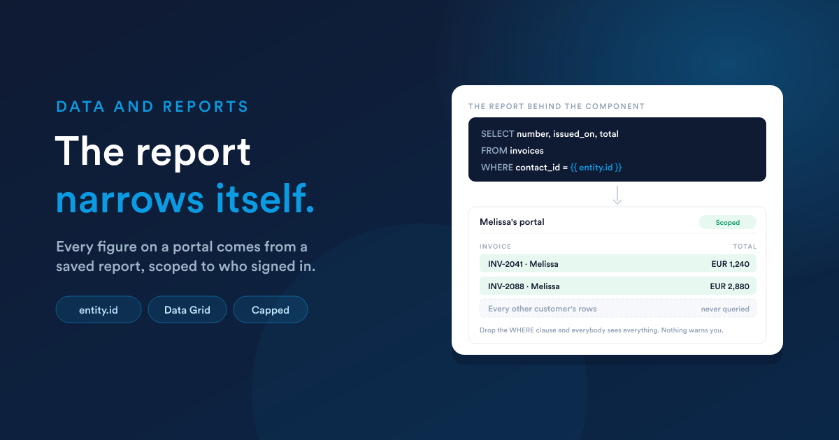
The data grid, the metric, the chart, the calendar and the map are all fed the same way: by a saved report. Not by an entity, not by a filter you configure on the component, and not by anything the browser asks for.
That is deliberate. A report already counts, sums, joins, filters and formats, and it is a thing you can open, run and check on its own. A second, weaker query builder inside each component would be one more place to be wrong.
The full guide to reports themselves is Reports.
The rule: the report narrows itself to the customer
The portal adds nothing to your report's SQL. If the report does not narrow itself to the signed-in customer, every customer sees every row.
The signed-in customer is available to the report as entity, so the condition goes where every other condition goes:
SELECT number, issued_on, total, status
FROM   invoices
WHERE  contact_id = {{ entity.id }}
ORDER BY issued_on DESC| You have | You write |
|---|---|
| a column holding the customer's id | WHERE contact_id = {{ entity.id }} |
| a join to reach them | join it, then compare against {{ entity.id }} |
| an account portal, rows tied to a company | WHERE account_id = {{ entity.id }} |
| anything on the record itself | {{ entity.email }}, {{ entity.company }}, any field |
Nothing else in the product will raise this. A report with no such condition runs perfectly, returns rows, and draws a healthy-looking table full of other people's data. Check every report before you put it on a portal, and check it again after anybody edits it.
The safest habit is to write the condition first, before the columns, and to open the report as a test customer once the component is on the page.
Data Grid reports, not HTML reports
Reports come in two output formats, and portal components want the first:
| Report format | Use on a portal |
|---|---|
| Data Grid | the grid, metric, chart, calendar and map: all five |
| HTML | not offered to those components at all |
An HTML report renders its own markup and returns no columns, so a chart pointed at one could only ever draw an empty picture. The pickers only offer Data Grid reports for that reason. If you want an HTML report's kind of freedom on a portal, that is what the HTML component is for, and it is better at it: it is edited where you are standing rather than in another screen.
Choosing the columns
Once a component names a report, every column picker on it offers that report's own columns. There is no naming convention to obey and nothing to rename: a map does not need columns called lat and lng, it needs you to say which of the report's columns those are.
Two consequences:
- Answer the report setting first. The column pickers have nothing to offer until they know which report to read.
- Renaming a column in the report can empty a setting that pointed at it. If a component stops drawing after somebody edited a report, that is the first thing to check.
What a customer's browser may ask for
Components are interactive: a grid pages and sorts, a calendar moves month, and your own markup can refresh a component with different parameters. So it is worth stating what a browser can and cannot influence:
| Component | May adjust |
|---|---|
| Data grid | rows per page, which page, sort column, sort direction |
| Chart | the row limit |
| Map | the marker limit |
| Calendar | the row limit, and the visible date range |
| Everything else | nothing |
Every one of those either narrows the answer, pages within it, or reorders it. None of them can widen what the report returned, and the limits are capped on the server, so nobody can turn a paged table into a full export by asking for a big enough page.
The ceilings
| Ceiling | Limit |
|---|---|
| Rows per request | 200 |
| Chart rows plotted | 500 |
| Calendar events | 500 |
| Map markers | 200 |
These are guards, not settings: something has to stand between a report that returns a hundred thousand rows and a page trying to draw them. A component regularly hitting one of them is a sign the report should be narrower, usually by date.
For a calendar in particular, the answer is the visible range:
WHERE appointment_date BETWEEN '{{ range.from }}' AND '{{ range.to }}'Written that way, the report returns the month the customer is looking at, and answers again each time they move.
Reports written for staff, reused on a portal
Most reports start life on a dashboard or a staff screen. Three things to look at before one goes on a portal:
- The customer condition. The rule above. A staff report almost never has one, because staff are meant to see everything.
- The links. Column formatting often builds links to staff screens, which lead a customer to the sign-in page. The markup renders correctly and the destination is still wrong.
- The columns. Internal ids, owner names, margins and cost prices are all perfectly ordinary in a staff report, and none of them belong in front of a customer.
A copy of the report, written for the portal, is usually cleaner than trying to make one report serve both audiences.
Checking it as a customer would see it
The builder's previews run your reports with no customer in context, which is the honest preview rather than an invented one: a report written against {{ entity.id }} previews as empty. That is not a fault, and a component that previews empty may be perfectly correct.
To see the real thing, use Preview to open the published portal and sign in as a test customer: a record on the customer entity, with an address you can receive mail at, marked active.