Creating a Form
Last updated 25 May 2026
The same flow applies to all three flavours; the differences are noted as you go. Start at the main menu under Forms (/forms), click New.
Step 1, the three first choices (you can't change them later)
When you create a form, three settings are locked once it has been saved:
| Setting | What it controls |
|---|---|
| Name | The form's display name in lists, emails, the URL slug, and reports. You can change this later. |
| Form type | External (public-facing) or Internal (for signed-in users). Locked after save. |
| Record type | The kind of record this form is attached to: Lead, Contact, Deal, Case, a custom record, or the virtual type for forms that aren't tied to one record. Locked after save. Only applies to Internal forms; External forms always submit as virtual. |
If you realise the choice was wrong later, you'll need to create a new form and copy the field layout across. Choose deliberately.
The fields you'll set on the create screen:
- Name, required.
- Alias, a machine-readable name (auto-generated from the name).
- Category, a folder, optional.
- Form type,
ExternalorInternal. - Record type, only shown if Form type is Internal.
- Create workflow automatically?, if ticked, Flexie creates a starter workflow with the matching listener wired up, so you can start adding steps straight away. Recommended for new forms.
Click Save and you're in the form builder.
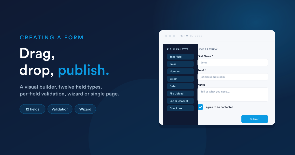
Step 2, the form builder (the visual canvas)
The builder is a drag-and-drop canvas. On the left is the palette of field types; on the right is the live form, exactly as a submitter will see it. You add fields by dragging them from the palette onto the form.
There are two layouts you can choose for the form:
- Single-page form (the default), all fields on one screen.
- Wizard, a multi-step flow where each step is a separate "page" of the form. The submitter clicks Next to move through them.
You set this when you create the form (or change it via the builder's view control, before fields are added). Inside a wizard, each step has its own title and its own set of fields.
Step 3, field types
The field palette offers these field types. The first group are data fields (they collect a value); the second group are layout fields (they just arrange the form).
Data fields
| Field | What it's for | Notable settings |
|---|---|---|
| Text Field | A single-line text input (name, ID, postcode) | Required, default value, placeholder, word count, character count |
| Text Area | Multi-line text (notes, descriptions) | Same as Text Field |
| An email address; the form validates the format on the client before submission | Required, default value | |
| Phone Number | A phone number (no automatic format validation) | Required, default value |
| Number | A number; submitter can only enter digits | Required, default value, min / max |
| Checkbox | A yes/no tick box | Required, default state |
| Select / Dropdown | A single choice from a list | The list of options (each option has a label shown to the user and a value stored), required, default value |
| Radio Buttons | A single choice as a row of buttons | Same as Select |
| Date | A calendar picker | Required, default value, date format |
| Time | A time picker | Required, default value |
| File Upload | One or more files attached to the submission | Single or multiple files (see File uploads) |
| GDPR Consent | A consent block, used to group one or more checkboxes around a legal-basis statement | Contains its own sub-fields |
Layout fields (no data)
| Field | What it's for |
|---|---|
| Content | A free-form HTML block: headings, explanatory text, images |
| Panel | A collapsible / expandable group of fields with a heading |
| Columns | A multi-column row to place fields side by side |
| Line | A visual separator |
| Button | The Submit (or Next, in a wizard) button |
Every data field has a
key. It's what the submission JSON uses to label that value. For example a field called "First Name" probably has the keyFirst Name. The key is also what your workflow steps read from__data(see Reading submissions). The key can contain spaces and special characters, which has implications for how you read it in scripts, covered in Submissions.
Step 4, per-field settings
Click any field on the canvas to open its settings panel. The settings vary by field type, but the common ones are:
| Setting | Effect |
|---|---|
| Label | The visible text next to the input. |
| Key | The system name, what the value is stored as. Auto-generated from the label. |
| Required | The form won't submit without a value. |
| Default value | What the field starts with when the form is loaded. |
| Placeholder | Faded hint text inside the empty input. |
| Custom validation message | The error message shown when validation fails (otherwise a generic one is used). |
| Description / tooltip | Extra hint text shown beside or below the field. |
For Select and Radio fields, you also configure the list of options: each option has a label (shown) and a value (stored).
Validation
Validation happens in the submitter's browser before the form is sent. The built-in checks are:
- Required, the field has a value.
- Type-correct, Email looks like an email; Number is numeric; Date is a real date.
- Length / min / max, where supported by the field type.
If a field fails validation, the form is not submitted. The user sees an inline error and the relevant field is highlighted.
Some abusive submitters bypass the client-side validation by posting straight to the submit URL. For external forms, layer a reCAPTCHA on top, see Spam protection.
Step 5, form-level settings
Open the form's Settings (separate from the field-level settings) to configure:
Identity
- Name, the form's display name.
- Alias, auto-generated; rarely needs editing.
- Category, optional folder.
- Published, the on/off switch. An unpublished form rejects every submission, even if its URL is reachable. Always publish before going live.
Layout & design
- Form image, a hero image at the top of the form.
- Accent colour, the colour of buttons and highlights.
- Optimise uploaded images, when on, image attachments are converted to a smaller, web-friendly format on upload (saves storage and bandwidth).
Post-submit behaviour (External forms only)
What the submitter sees right after they submit. Two options:
- Show a message, a confirmation message you write (Flexie Scripting allowed).
- Redirect to a URL, send them on to a thank-you page.
These are the defaults. A workflow can override the response per-submission using the Form Respond action, see Writing a custom response.
Spam protection, Google reCAPTCHA v3 (External forms)
Covered in Public forms: Spam protection.
Analytics (External forms)
- Google Analytics tracking ID (e.g.
UA-…orG-…), emits a form-submit event when the form is sent. - Anonymise IP, sets the
anonymizeIpflag for GA, for GDPR compliance. - Facebook Pixel ID, fires a Lead event on submit.
Legal basis (External forms)
For GDPR compliance you must declare a legal basis for processing submitted data. The form requires you to choose one (Consent, Contract, Legal obligation, Vital interests, Public task, Legitimate interests, Pre-contractual measures).
Access (Internal forms)
Who can see and use the form: everyone, or specific roles, user groups, or individual users. See Internal forms: Access control.
Placement (Internal forms)
Where the form should appear in the app: on the record's profile, in the top navigation, in the dialer, or any combination. See Internal forms: Where the form appears.
Step 6, test before going live
Before publishing:
- Open the form as a submitter would. For an External form, open
/form/{identifier}; for an Internal form, find it on a record's profile or in the top-nav. - Submit a real test with realistic values.
- Check it landed in the right place, see Submissions.
- Check the workflow it triggers, open the workflow's Logs view to confirm each step ran with the values you expected.
- If your form uses reCAPTCHA, test from a normal browser session. A headless test can fail the score check.
Fix anything you find, then publish.
What is not configurable
A few things are intentionally fixed:
- The submission endpoint URL. External forms post to
/form/push/{identifier}regardless of how you embed them. You can't change the path; you can only change the host (your Flexie instance). - The data shape sent back by the workflow. The form-respond pattern has four fixed response types (
message,redirect,error,json), see Forms in workflows. - Form type and record type after creation, as noted at the top of this page.
Next steps
- For an External / public form: Public forms.
- For an Internal form: Internal forms.
- After you've collected some submissions: Submissions.
- To make the form drive an automation: Forms in workflows.