Report Widgets
Last updated 25 May 2026
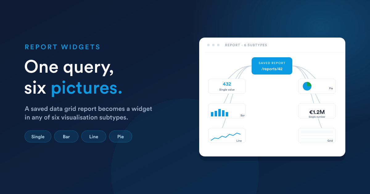
Whenever you save and publish a data grid report, Flexie automatically adds it to the dashboard's "Add Widget" menu under Reports. Pick the report, then choose one of six visualisation subtypes for how it should render. The report's query is the data source; the widget settings choose the picture.
This means:
- You only have to maintain one query, the report, and you can use it as many widgets as you like, in multiple ways, across multiple dashboards.
- Editing the report's query updates every widget that uses it.
- The report can still be opened directly at
/reports/view/{id}for its full grid view, while the widget shows a slimmed visualisation.
The six subtypes
When you add a Report widget, the configuration screen asks how should this report be rendered? with these choices:
| Subtype | Looks like | Use it for |
|---|---|---|
| Single value | One large number with a label below | A "top KPI" tile |
| Single number | Same as Single value (synonym kept for clarity) | A "top KPI" tile |
| Line chart | An X/Y line graph | A trend over time |
| Bar chart | A vertical bar graph | A ranking, top N items by value |
| Pie chart | A pie with a legend | Composition, share of a whole |
| Grid | A small paginated table inside the widget | A short list view inline on the dashboard |
The subtype is set per-widget: the same saved report can be three different widgets on three different dashboards, drawn differently each time.
Configuring each subtype
Single value / Single number
Picks one cell from the result and shows it.
| Setting | Meaning |
|---|---|
| Value column | The column whose value should be displayed. Required. |
Tip: write the report so it produces one row (typically with a SUM(...) or COUNT(...) query). Single-value widgets read row 0 of the result.
-- A report shaped for a Single-value widget:
SELECT COUNT(*) AS open_deals
FROM deals
WHERE is_won = 0 AND is_lost = 0
Widget settings: Value column = open_deals.
Line chart
Plots an X/Y curve from two columns.
| Setting | Meaning |
|---|---|
| X-axis column | The horizontal-axis column (typically a date) |
| Y-axis column | The vertical-axis column (the numeric value) |
| Limit | How many rows to plot (default applies; max 1,000) |
| Order by / direction | Sort the rows before plotting |
-- A report shaped for a Line widget:
SELECT DATE(date_added) AS day, COUNT(*) AS deals
FROM deals
WHERE date_added > DATE_SUB(NOW(), INTERVAL 30 DAY)
GROUP BY DATE(date_added)
ORDER BY day ASC
Widget settings: X-axis = day, Y-axis = deals.
Bar chart
Plots a value per category.
| Setting | Meaning |
|---|---|
| X-axis column | The category column (e.g. user name) |
| Y-axis column | The numeric value column (e.g. won total) |
| Limit | Top N to plot |
| Order by / direction | Almost always your numeric column DESC, to make Top N actually be the top |
SELECT u.full_name AS user, SUM(d.amount) AS total
FROM deals d JOIN users u ON u.id = d.owner_id
WHERE d.is_won = 1
GROUP BY u.id
ORDER BY total DESC
Widget settings: X-axis = user, Y-axis = total, Limit = 10.
Pie chart
Plots slices labelled by one column, sized by another.
| Setting | Meaning |
|---|---|
| Label column | The column whose values name each slice |
| Value column | The numeric column that sizes each slice |
SELECT status AS label, COUNT(*) AS count
FROM cases
GROUP BY status
Widget settings: Label = label, Value = count.
Pie charts are not limited in the same way Bar and Line are; you typically want to show all slices.
Grid
Renders the report's data as a small table inside the widget, useful when your dashboard wants to show a short list rather than a chart.
The widget shows the report's columns; you control the row count via the widget's size (rows that don't fit are paginated).
A worked end-to-end example
Goal: a "Top 10 customers by lifetime value" widget on the team dashboard.
Step 1, build the report
Create a data grid report (/reports/new) with this query:
SELECT a.account_name AS customer,
       SUM(d.amount)  AS lifetime_value
FROM   deals d
JOIN   accounts a ON a.id = d.account_id
WHERE  d.is_won = 1
GROUP  BY a.id
ORDER  BY lifetime_value DESC
Set the default order to lifetime_value DESC. Save, publish.
Step 2, add it to the dashboard
On the dashboard, Add widget, then category Reports, pick the report you just made.
Step 3, configure the visualisation
- Subtype: Bar chart.
- X-axis column:
customer - Y-axis column:
lifetime_value - Limit: 10
- Order by:
lifetime_value - Direction: Descending
- Width / Height: 50% / 445px
Save. The widget now appears on the dashboard, showing the top 10 customers as a bar chart, refreshing on the cache lifetime you set.
The same report could just as easily be the data source for:
- A Single value widget: display the top customer's name and value.
- A Pie chart: show the relative share of top customers.
- A Grid widget: the full top-10 as a small table.
You only wrote the query once.
When the data source changes
Edit the underlying report (different query, more columns, different sort) and every widget using it picks up the new shape on its next refresh. If you rename a column, widgets that reference the old name (for example as X-axis or Value column) need to be reconfigured; otherwise they error.
The 1,000-row cap and the read-only restrictions on the report's query still apply, see Data Grid reports: What the query can do.
When a report widget isn't enough
If the layout you want isn't a single chart or a single table, for instance you want three KPIs in one widget, or a chart with custom labels next to it, or any non-rectangular presentation, drop down to a Custom HTML widget instead. It uses an HTML report as its source and gives you full control over what is rendered.
Next steps
- Custom HTML widgets: when none of the six subtypes fit.
- Layout & sharing: sizing, caching, multiple dashboards.