---
title: "Custom HTML Widgets"
url: https://flexie.io/resources/dashboards/custom-html-widgets
description: "Drop an HTML report onto a dashboard and the rendered template becomes the widget. With the full Flexie Scripting toolkit and any JavaScript library, you can build any widget you can imagine."
---

# Custom HTML Widgets

Last updated 25 May 2026

![A Flexie dashboard with a custom HTML widget rendering three KPI tiles, a heatmap, and a leaderboard inside one tile](https://flexie.io/image/resources/dashboards-custom-html-widgets.png)

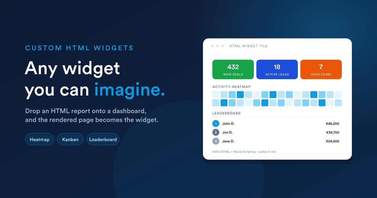
When the built-in widgets and the six Report visualisations aren't enough, drop in an [HTML report](https://flexie.io/resources/reports/html-reports) as a widget. Because the HTML report can do anything HTML can do, combined with the full [Flexie Scripting](https://flexie.io/resources/flexie-scripting/overview) toolkit, **you can build any widget you can imagine**.

## How it works

1. You create an [HTML report](https://flexie.io/resources/reports/html-reports) (Reports → New → Output format = **HTML**) with a template that produces exactly the layout you want: KPI cards, custom charts, multi-section grids, anything.
2. Once that report is **published**, it appears in the dashboard's "Add widget" menu under **Reports**, just like a data grid report, but with a distinct subtype: **HTML**.
3. When you add it as a widget, no further visualisation choices are needed (no axes, no value columns). The whole rendered template _is_ the widget.

The widget renders its HTML inside its tile on the dashboard. Inside that tile, anything goes: your styles, your JavaScript, your custom mini-charts.

## Why this matters

The dashboard's built-in chart engine renders **line, bar, pie, and funnel**. That is already a lot. But if you want:

* **Three KPIs in one tile.** Sales, leads, NPS, side by side, each with its own colour and trend arrow.
* **A heatmap, a treemap, a Sankey**, anything outside line/bar/pie/funnel.
* **A custom layout**, a table on the left, a chart on the right, captions underneath.
* **A "kanban-as-a-widget"**, columns drawn from your data.
* **A live status board**, colour-coded cards with conditional formatting.
* **Embedded media**, a PDF preview, a video, an image gallery driven by your data.

…**none of those fit a pre-defined visualisation type**. With an HTML widget, the visualisation is whatever you write, including pulling in third-party chart libraries via a `<script src="…">`.

## A worked example, a three-up KPI tile

A single widget showing three KPIs side-by-side, each with its own colour and a small caption.

### Step 1, create the HTML report

Reports → New → Output format = **HTML**. Paste this into the template field:

```html
<style>
  .kpi-row { display: grid; grid-template-columns: repeat(3, 1fr); gap: 1rem; }
  .kpi     { padding: 1rem; border-radius: 8px; color: #fff; text-align: center; }
  .kpi.green  { background: #16a34a; }
  .kpi.blue   { background: #1d4ed8; }
  .kpi.orange { background: #ea580c; }
  .kpi-num  { font-size: 2rem; font-weight: 700; line-height: 1; }
  .kpi-lbl  { font-size: .75rem; opacity: .9; margin-top: .35rem;
              text-transform: uppercase; letter-spacing: .04em; }
</style>

<div class="kpi-row">
  <div class="kpi green">
    <div class="kpi-num">{{ findCount("deal", "is_won", 1) }}</div>
    <div class="kpi-lbl">Won deals (all-time)</div>
  </div>
  <div class="kpi blue">
    <div class="kpi-num">{{ findCount("lead", "is_published", 1) }}</div>
    <div class="kpi-lbl">Active leads</div>
  </div>
  <div class="kpi orange">
    <div class="kpi-num">{{ findCount("case", "status", "open") }}</div>
    <div class="kpi-lbl">Open cases</div>
  </div>
</div>

```

Name it _"Quick KPIs"_, save, **publish**.

### Step 2, add it as a widget

Dashboard → **Add widget** → category **Reports** → pick _Quick KPIs_. Set the widget size to e.g. **50% × 215px**. Save.

The dashboard now has a three-up KPI tile that pulls live counts whenever it refreshes.

## What you can use inside

Everything Flexie Scripting offers is available, see [HTML reports: what the template can use](https://flexie.io/resources/reports/html-reports#what-the-template-can-use) for the full list. The most useful for widgets:

* **`findCount(...)` / `findSum(...)`**, straight-to-the-database aggregates, best for "big number" tiles.
* **`query("SELECT ...")`**, when you need a small list of rows for a custom layout.
* **`getDealStats`, `getInvoiceStats`, `getCaseStats`**, bundles of figures for an entity, returned in one call.
* **`now()`, `date(...)`, `dateAdd(...)`**, labelling and "last-X-days" windows.
* **`formatCurrency`, `numberFormat`, `truncate`**, presentable values.
* **`qrCode`**, embed a live, data-driven QR code into a widget.

For a list of records to render as your own custom layout:

```html
{% set hot = query("
  SELECT name, amount, stage_id
  FROM   deals
  WHERE  is_won = 0 AND is_lost = 0
  ORDER  BY amount DESC
  LIMIT  5
") %}

<h3>Hot deals</h3>
<ul style='margin: 0; padding-left: 1.2rem;'>
  {% for d in hot %}
    <li>{{ d.name }} — {{ d.amount | number_format(0) }}</li>
  {% endfor %}
</ul>

```

## Adding a custom chart

You can pull in any JavaScript charting library by `<script src>` and feed it data straight from a `query(...)`:

```html
<div id="chart" style="height: 220px;"></div>
<script src="https://cdn.example.com/some-chart-lib.min.js"></script>
<script>
  const data = {{ query("
    SELECT month, sales
    FROM   monthly_sales
    WHERE  year = 2026
    ORDER  BY month
  ") | json_encode | raw }};

  new SomeChartLib(document.getElementById('chart'), {
    type: 'heatmap',
    data
  });
</script>

```

`| json_encode | raw` is the safe way to embed a server-computed value inside a `<script>` block. It produces a properly-escaped JSON literal that can't break the JavaScript on quotes, newlines, or non-printable characters. See the note on [Security](https://flexie.io/resources/reports/html-reports#security-what-to-keep-in-mind).

## Sizing and refresh

Custom HTML widgets follow the same sizing model as any other widget: pick a width (`25 / 50 / 75 / 100%`) and a height (a preset pixel value, or **Auto** to grow with the content). Use **Auto** when your HTML's natural height is unpredictable; pick a fixed height when you want the tile to slot into a row with the same height as its neighbours.

The same **cache lifetime** mechanism applies. Set it lower for KPI tiles that need to feel live, higher for monthly summaries.

## When _not_ to use an HTML widget

* **For one of the built-in visualisations**: line, bar, pie, funnel done with a Report widget is far simpler than rebuilding it in HTML.
* **When the same simple metric is already a built-in widget**: use the built-in. HTML widgets cost more to maintain.
* **For very large data sets**: the 1,000-row cap still applies to `query(...)` and friends inside the template. Aggregate before rendering.

## Security & maintenance

Treat HTML widgets like code:

* **Restrict who can edit them.** A user with the **Edit** permission on reports can put arbitrary JavaScript in a tile every other viewer runs.
* **Always `| json_encode | raw`** anything you put inside `<script>`.
* **Always escape** anything you put into `href` or `src` with `url_encode`.
* **Don't paste opaque third-party snippets** you don't understand.

See [HTML reports: Security](https://flexie.io/resources/reports/html-reports#security-what-to-keep-in-mind) for the longer treatment.

## Next steps

* [Layout & sharing](https://flexie.io/resources/dashboards/layout-and-sharing): sizing, ordering, caching, public sharing.
* [Reports: HTML reports](https://flexie.io/resources/reports/html-reports): the data source side of this picture.
